tumblr_n192jwtRKa1qb4u2io1_1280.jpg
tumblr_n192jwtRKa1qb4u2io2_1280.jpg
tumblr_n192jwtRKa1qb4u2io3_1280.jpg
tumblr_n192jwtRKa1qb4u2io4_1280.jpg

New York-based artist Daniel Rozin creates amazing installations and sculptures that have the ability respond to the presence of a viewer. Among his best known works are an ongoing series of interactive mirrors built from complex arrays of moving objects including wooden pegs, circular bands of laminated rings, plastic spokes and even pieces of discarded trash. Using custom software and video sensors Rozin has the sculptures react in real-time to create a live visual representation of a viewer’s likeness. Via bitforms gallery:

Merging the geometric with the participatory, Rozin’s installations have long been celebrated for their kinetic and interactive properties. Grounded in gestures of the body, the mirror is a central theme of Rozin’s practice. In his art, surface transformation becomes a means to explore animated behavior, representation, and illusion.

Since the late 1990s, his constructions have also investigated the psychological and optical cues inherent to image building, such as pattern and the materiality of the picture plane. Often the grid is carefully controlled with a computer and custom software. Visual structures such as that of haystacks, woven fabric, stone mosaics, the pixel, and particulate accumulations are among the many influences and diverse textures evoked by his installations.

This fall Rozin will unveil a new installation commissioned for the Taiwan Taoyuan international airport, and his most recent solo exhibition, Angles, was held at bitforms gallery last year. All photo and video courtesy bitforms gallery. (via Hi-Fructose)

Buried in the archives of the British Museum is this wonderful series of lithographs from illustrator Charles Joseph Hullmandel that transforms the English alphabet into sweeping landscapes. Hullmandel was one of the most important figures in the ad…

Buried in the archives of the British Museum is this wonderful series of lithographs from illustrator Charles Joseph Hullmandel that transforms the English alphabet into sweeping landscapes. Hullmandel was one of the most important figures in the advancement of British lithography in the first half of the 19th century. These particular pieces were produced sometime between 1818 and 1860 and you can see the full collection here. (viaJuxtapoz)

tumblr_n192d409XU1qb4u2io1_1280.jpg
tumblr_n192d409XU1qb4u2io2_1280.jpg
tumblr_n192d409XU1qb4u2io3_1280.jpg
tumblr_n192d409XU1qb4u2io4_1280.jpg
tumblr_n192d409XU1qb4u2io5_1280.jpg
tumblr_n192d409XU1qb4u2io6_1280.jpg

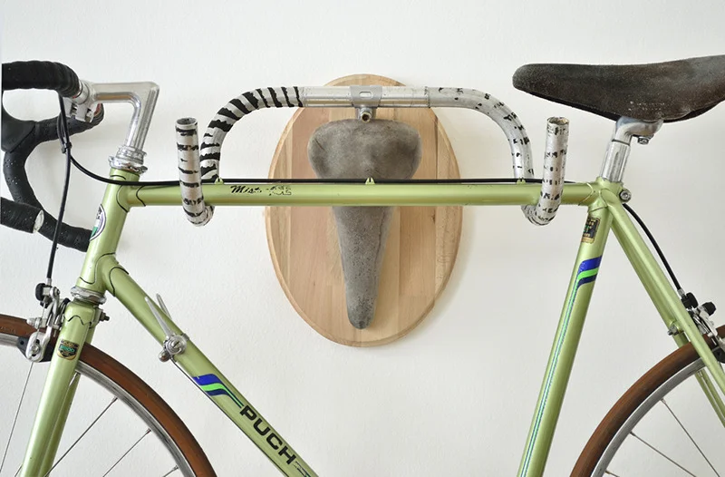
Vienna-based designer Andreas Scheiger created this fun series of faux taxidermy heads using a bunch of found bicycle seats and handlebars. The pieces can serve as fun art objects, or as functional hooks for holding bags, coats, and even other bicycles. Several of them are for sale over on his website, or you can see how he did itand maybe attempt your own. (via Fubiz)

tumblr_n191zatE2V1qb4u2io3_1280.jpg
tumblr_n191zatE2V1qb4u2io1_1280.jpg
tumblr_n191zatE2V1qb4u2io2_1280.jpg

Work in a creative industry? Then chances are you’ve seen Stefan Sagmeister’s Things I Have Learned in My Life So Far kicking around the office. Sagmeister has managed to establish himself as one of contemporary design’s household names, and his book, a bible of sorts to the design-orientated. If you’re not familiar with Sagmeister, Things I have Learned, or modern design, then there’s no better time to grab Abrams Books’ updated release, which contains everything the book is famous for, and then some.

Things I Have Learned in My Life So Far is built upon a variety of Sagmeister’s personal maxims—ideas as a result of a life long journal he kept. One part pragmatic, equal part philosophical, there’s much to admire and take from these maxims. Designing around seemingly ‘hollow statements’ is no doubt a trend in graphic design, heck, I’d even argue that Sagmeister helped popularize it, but to me, his have always felt different.

There’s a level of authenticity to observe: these are the lived lessons of a man who wore these ideals day-in-and-day-out. And the manner in which he has chosen to capture them wholly reflects the thoughts, making it easy to understand and easier to soak in. Reading the book with an open mind warrants the opportunity to approach life with equal parts humility and vulnerability.

The work within demonstrates Sagmeister’s ability to blur the lines of graphic design and art. Sagmeister comments, “I see it all as graphic design, it’s made by a graphic design office in mediums normally employed by design and all has a client behind it. But from a viewer’s point of view it doesn’t matter. The whole question of art versus design has limited interest—it comes in waves, in the 20th century there were times when art and design were embedded in each other, the Bauhaus for instance, and then they separated, and then they came back together, and then they separated… From the viewer’s point of view, it’s always just a question of ‘is it good or not?’.”

Love it or hate it, it’s difficult to deny some of the brilliance encapsulated in many of his projects. I remember the first time I came across Sagmeister’s work, specifically this book, and how it affected my thought, as well as my perception of art and design.

Last week’s post touched on the importance of keeping a journal. Sagmeister’s Things I have Learned in My Life So Far further compliments this notion, in that the project’s entirety is as a direct result of his journaling.

“I use the diary to go back and reread certain passages, to see what my thinking was, and, most importantly, to discover things I feel need changing: when I have repeatedly described a circumstance or character trait of mine that I dislike, I eventually wind up doing something about it.”

Not only has his journal given way to all the work he’s famous for (and in turn, built quite the successful career), but it has also aided in the development of his person. Folks, it’s obvious my adoration for literally taking note of your life, and hopefully, even more obvious how doing so can enrich the soul, or lead to a badass project or two. You cannot lose.

The reissue comes in at $45 and capitalizes on the ‘so far’ nature of the book’s name, complementing the content of the original release with 48 pages of new material that touches on everything from obsession to confidence to love. Not only that, but the update is contextualized by a bevy of great minds: psychologist Daniel Nettle, design critic Steven Heller, and Guggenheim curator Nancy Spector. It’s available now, so have at it.

(Excerpt from Nick Partyka’s article on http://www.thefoxisblack.com/2014/02/14/sagmeisters-things-i-have-learned-in-my-life-so-far-gets-an-updated-release/)

sony to sell waterproof 4GB mp3 walkman in bottles of waterall images courtesy draftfcb


since launching at the 2013 CES in las vegas, sony approached auckland-based advertisment agency draftfcb to help produce a campaign for their ‘NWZ-W27′ walk…

sony to sell waterproof 4GB mp3 walkman in bottles of water
all images courtesy draftfcb


since launching at the 2013 CES in las vegas, sony approached auckland-based advertisment agency draftfcb to help produce a campaign for their ‘NWZ-W27′ walkman sports mp3 player, a water-proof, all-in-one digital device with 4GB of internal memory. designed specifically to withstand not just water but the sweat from intense workouts, the compact mp3 provides a perfect solution for everyone from the health conscious to performance sports athletes. to showcase its waterproof capabilities, the marketing initiative re-purposes the ubiquitous vending machine into a unique sales portal for athletes looking for a new waterproof music player.

tumblr_n0w3v8g1ad1qb4u2io1_1280.jpg
tumblr_n0w3v8g1ad1qb4u2io2_1280.jpg

This striking series of photographs comes from photographer Daniel Seung Lee. Entitled Corolla, the work consists of simple still-lifes yet by removing the colour in each of the images they become far more interesting and engaging. “[Corolla] is a study on the texture and form of flowers” says Seung Lee and through these dark and subtle pictures he highlights the beauty that exists in each of these plants.

tumblr_n0w3roM7Hq1qb4u2io1_1280.jpg
tumblr_n0w3roM7Hq1qb4u2io2_1280.jpg
tumblr_n0w3roM7Hq1qb4u2io3_1280.jpg
tumblr_n0w3roM7Hq1qb4u2io4_1280.jpg
tumblr_n0w3roM7Hq1qb4u2io5_1280.jpg

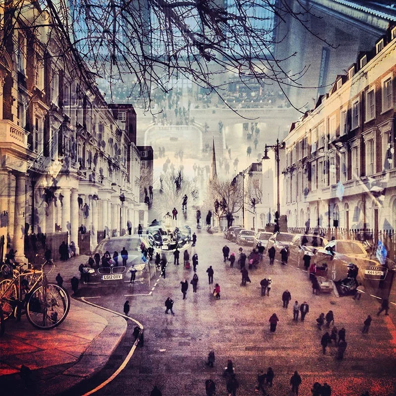
Daniella Zalcman is a New York based artist who currently works as a freelance photographer for The Wall Street Journal. Her latest series ‘London + New York’ is a collection of double exposures and at the same time a love letter to two beautiful cities.

She created this series to map the intersections between two sets of streets and skylines. It explores place, memory, and identity through architecture and nostalgia. Brooklyn Bridge Park meets Leicester Square. Whitehall meets the South Bronx. The High Line meets Knightsbridge. After a while, the cacophony of concrete and street life begins to blend into something more universal and collectively represent her vision of home. ‘My hope is that in the noise and silence, everyone will find something that feels like home.’

tumblr_n0u8o6xOGn1qb4u2io1_1280.jpg
tumblr_n0u8o6xOGn1qb4u2io2_1280.jpg

Amelia Bauer created the series ‘Burned Over’ in the forests of Central New York. Inspired by the mysterious stories that evolve around the ‘burned-over district’ of upstate New York, Amelia used artificial lighting to act as an outside force on the landscape. The territory was the birthplace of several early American religious and occult groups. The photographs reveal something felt but not seen about these forests, as though the land itself holds a presence we seek to uncover but fear revealing entirely.v

tumblr_n0u8mvmAXc1qb4u2io2_1280.jpg
tumblr_n0u8mvmAXc1qb4u2io1_1280.jpg

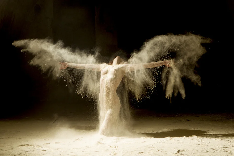
Ludovic Florent created the series ‘Poussières d’étoiles’ (Stardust), highlighting the natural beauty of the human body. He explains: ‘Behind every carnal envelope hides a soul that is both sensitive and flamboyant as I try to capture in each of my photographs.’ We certainly enjoy his work guided by a humanistic look, finding expression in a series that is both, sensitive and vivid.

tumblr_n0qsj97wFs1qb4u2io1_1280.jpg
tumblr_n0qsj97wFs1qb4u2io2_1280.jpg
tumblr_n0qsj97wFs1qb4u2io3_1280.jpg
tumblr_n0qsj97wFs1qb4u2io4_1280.jpg
tumblr_n0qsj97wFs1qb4u2io5_1280.jpg

Horyon Lee creates fetishized images of women’s bodies, revealed through lifted or taken down skirts. He reflects different positions between men who are tempted and women who tempt as a symbolical expression of eroticism. The women in the painting, who are the object of desire, are presented as exhibitionists who explicitly expose their femininity regardless of voyeurs. The overlapping images create a dynamic impression, as if they were moving.

The artist explains: ‘First of all, while I gaze through a view finder at a part of a model’s body, or one with a hidden face, the model takes a positive pose towards the camera. Therefore, I intend to show an intertwined point of an agent, object and situation that is both looking at and being shown.’

tumblr_n0qsbuXSEc1qb4u2io1_1280.jpg
tumblr_n0qsbuXSEc1qb4u2io2_1280.jpg
tumblr_n0qsbuXSEc1qb4u2io3_1280.jpg
tumblr_n0qsbuXSEc1qb4u2io4_1280.jpg
tumblr_n0qsbuXSEc1qb4u2io5_1280.jpg
tumblr_n0qsbuXSEc1qb4u2io6_1280.jpg

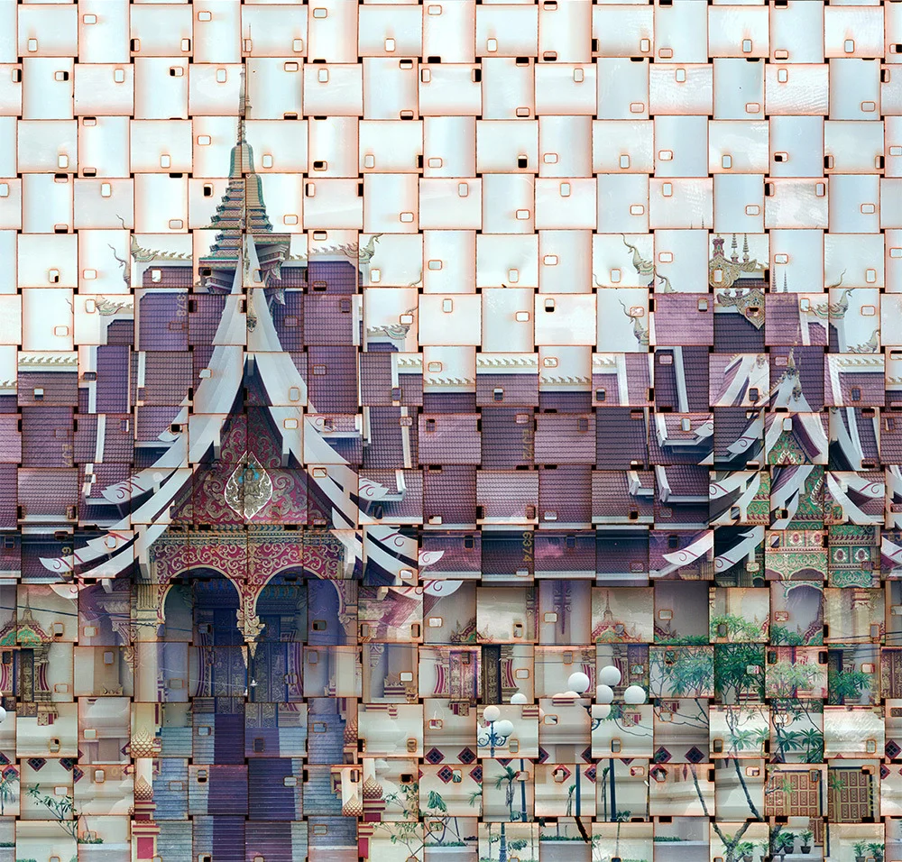
Part collage, part photography, part tapestry, these fragmented interpretations of iconic buildings and landmarks by Seung Hoon Park (previously) are truly something to ponder over. Each image begins with 8mm or 16mm camera film strips which he lays down in rows to create a larger surface that effectively acts as a single piece of film. Park then exposes two images in a large format 8×10″ camera using sets of vertical and horizontal strips which are woven together to create a final print. The photographer has traveled to locations around the world including Rome, Milan, Venice and Prague to shoot images for this ongoing series titled Textus. Several limited edition prints are available through Susan Spiritus Gallery.